Saturday, 12 April 2014

100th post!!!

For some reason reaching this significant milestone in my blogging..... life? Career? Journey? Why not supernatural adventure? Alice-in-wonderland romp? feels like an almighty achievement that should be acknowledged (if not by a party, cakes,teeeaaaa! and much singing and dancing, (Alice in Wonderland, definitely Alice in Wonderland! and, I realise, yes I have just managed brackets within brackets?!?!) then at least by a joyous WAAYHHHOOOOOO!!!! from me and maybe a slightly bewildered glance from you!). So, WAAAAAHOOOOOO!!!! HOOORAAAY for me! There it is, it had to be done! Now down to business.
As it happens the post I had planned to write (before getting marginally sidetracked by the realisiation of it being my 100th post! 100th POST!!! That's 100 things I've said and shared!) was quite appropriately celebratory. For I have actuallly etched my first copper plate in the studio and it did not, as I had feared, turn into a complete disaster! Another cheer!
Of course, printing will prove it's real success but it has come out better then I could have hoped on the plate. As we have yet to experiment with aquatint I wanted to create an image that would stand alone just as a line print without the opportunity of creating large areas of tone. I think this is achieved. Celebrations all round. And...with an image of a rabbit/hare as my parting shot, this is most decidedly the 100th post of my Alice-inWonderland-romp!

Saturday, 29 March 2014

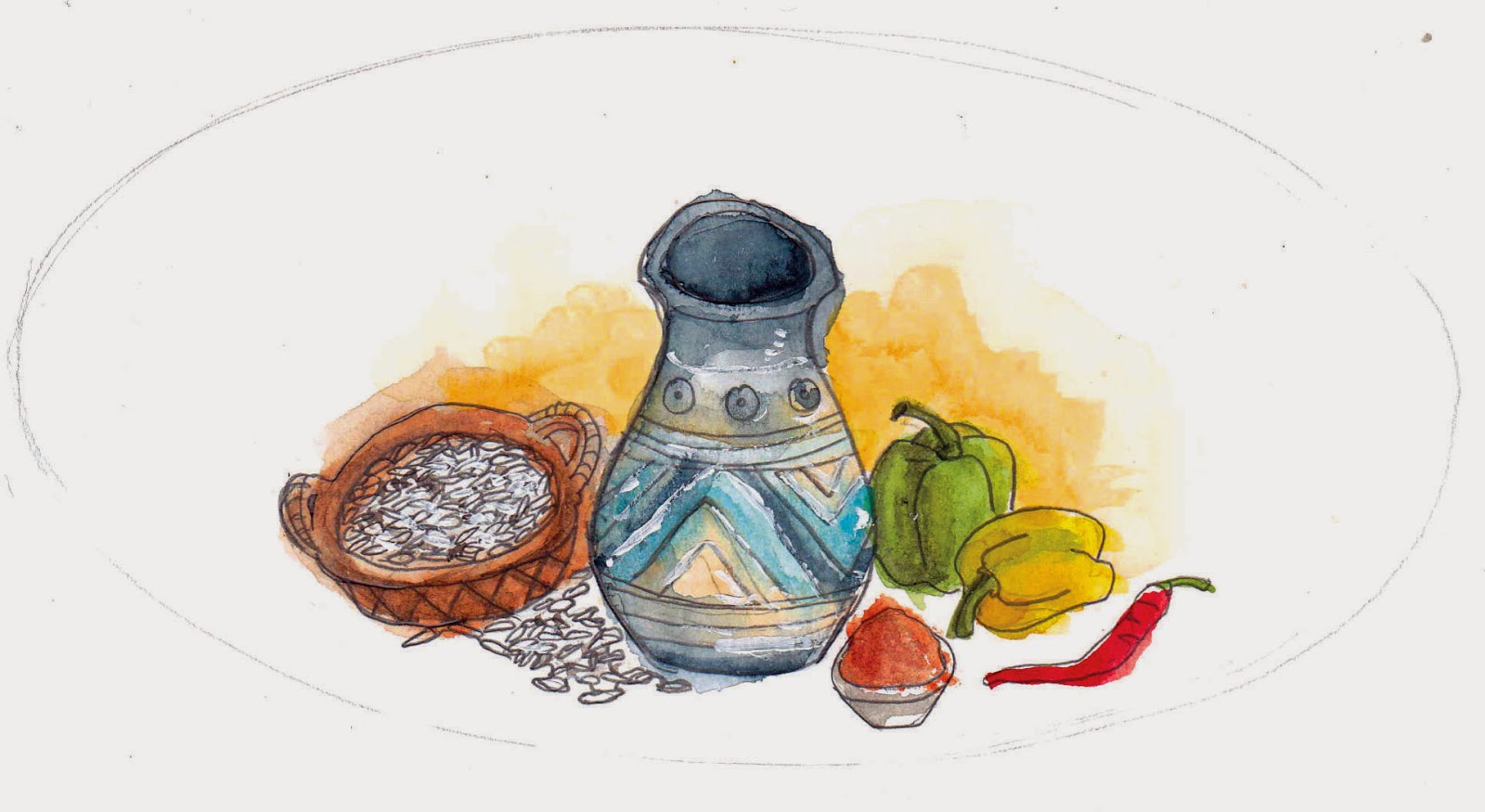
It's hard drawing food!

I've been illustrating some recipes for a project undertaken by Merton and Wandsworth Asylum Welcome. It's been fab to work on something that I feel can make a difference. But drawing food is hard! Here are my efforts. Enjoy the visual feast!


Saturday, 8 March 2014

p.s

Here is my best attempt at kitchen litho so far. I'm hoping repeated practice will make, if not completely perfect, at least close enough. I would stress that this image was printed from tin foil which had been etched by coca cola! Bear that in mind and it looks a whole lot more impressive!


Printmaking again.

I have found a place to do printing closer to home with a local (very talented) artist who is in the process of devoting a part of her studio into a print space (with a little help from myself). We've been waiting for the arrival of a press (sooo exciting!! it should be arriving in the next few weeks!!!) and so in-between gathering up the many and various materials needed for etching, we've been experimenting with Kitchen Lithography (check out the video below....all I'll say is tin foil and Coka Cola!) and I've been re-introduced to Monoprinting.


After falling in love with etching, which is all about the process, the very long, slow and multi-layered process, I'd always thought the simplicity of monoprinting relegated it to more of a sketchbook partypiece. A cheaty way of printmaking really when you took into account the skill needed for most other forms of printing. However, after struggling with the temperamental and down right contrary nature of kitchen litho, it was exactly it's very ease that made me see it in a new light. Dare I even say (such an infuriating term as) the quality of line you can achieve from monoprinting, also recommended it to me when it hadn't before. The pieces below were really just experimental for me but I loved the results. 


I was going to enter a film poster competition for films directed by women, however, I struggled to draw a good likeness of Holly Hunter from The Piano and then subsequently ran out of time. I got some nice sketches for it to work out composition and shading though and I'd like to point out that the writing was done free hand and back-to-front while holding the pen strangely so as to prevent wresting my hand on the paper and in so doing transferring unwanted ink. Pretty good going I'd say!


Saturday, 22 February 2014

The Golden Age of Female Illustrators

Who would have thought that my recent foray into the realm of the virtual pin-board would have yielded such exquisite finds? Who would have thought that more then the opportunity of promoting my own work, it is the wealth of related images that fill my inbox from other pinteresters that's got me excited? Certainly not me! And I found myself asking the question, as I did a quick reccy on google of several names I'd come across on other pin-boards, how did I not know of these illustrators before now? How had I gone through an art foundation and a three year degree in illustration, not to mention the rest of my life!! without coming across their work? How on earth could it be Pinterest...Pinterest people!! that was finally filling in the holey socks of my education?!?! The answer is a simple one and yet still, somehow (naively?) astounding. They are all women. The list of illustrators I looked at this morning are all women who were around and producing art during the period that is now regarded as the Golden Age of Illustration in Europe. It was inspired by the Pre-Raphaelites at the end of the Nineteenth century and lead on to other such glorious movements as Art Nouveau, Arts and Crafts and Art Deco during the early Twentieth century and included illustrators such as Arthur Rackham, Edmund Dulac and Kay Nielsen (all well known and well loved names). I would boldly consider the work of these female illustrators as equal to such champions of the Age, however, the annals of History do not agree. I've compiled a small list here of women who I feel deserve to be counted with the men. One day I dream of standing with them.

Bertha Lum (1869 – 1954) . She was an American artist who lived in Japan over several periods in her life and helped to make the Japanese and Chinese woodblock printing process known outside of Asia. Her work sweetly combines the fluidity and style of both Japanese art and Art Nouveau. I love the lights in this image, the yellow just pops out next to the subtle grey and blue tones of the rest of the picture and draws the eye in. 


Jessie M. King (1875 – 1949). She was a Scottish illustrator mostly of children's books although she also designed jewellery, fabric, and painted pottery! The delicacy of her line work and colour pallet is beautiful here and makes me want to hold her originals in my hands so that I can peer at it up close to see all the details. I feel some of it is lost on the computer. 


Emma Florence Harrison (1877–1955). She was an English illustrator of both poetry and children's books. Her work is both strongly Pre-Raphaelite and Art Nouveau based although her lightness of touch is uniquely her own. I love how the colours glow in this image through the contrast of the cool blues and warm oranges.


Cecile Walton (1891 – 1956). She was a Scottish painter, illustrator and sculptor and a leading member of the Symbolist movement in Edinburgh. The subtlety and coolness of the colours creates a beautifully mournful mood in this image and is also true of all her work. 


Jennie Harbour - (1893 - 1959). She was an English illustrator between 1917 and 1936 but very little else is known about her life before and after those dates. Her works of art are little gems, so saturated with jewel-like colours. You can't be fooled by the simplicity of her compositions because her colours do all the talking.


Monday, 17 February 2014

The Waves, the Waves are green!

I took the metaphorical plunge and coloured the image I had only pencilled in in my last post about The Waves, the Waves. Here it is looking all glossy green!


Friday, 14 February 2014

Pinteresting!

I now have a pinterest account where you can find the inspiration behind my illustrations. It also gives me the opportunity to spread my own work further and wider...hopefully! So get pinning guys! And don't forget to check out my pinterest account.